An easy way to fix Text Too Small To Read and Clickable elements too close together is by injecting the CSS below in Admin Dashboard->Appearance->Customize->Additional CSS. Then insert the following code:
@media only screen and (max-width: 1024px) {
	a {
	font-size: 1.5em !important;
	padding: 1em;
	}
	input {
		padding: 1em !important;
	}
	.meta-text {
	font-size: 3rem!important;
	}

	time {
		font-size: 1.5em!important;
	}

	.ancestor-wrapper {
		padding: 1em;
	}
	.entry-categories {
		display: none;
	}
	.wp-block-code {
	font-size: 1.5em;
	}
	p {
		font-size: 1.5em!important;
	}
}
This fixes my issues with mobile page experience for the Twenty Twenty WordPress theme. If you are using another theme then you might need to adjust the size for other elements as well.
CSS Explanation
What the CSS script first does is to only work when the screen is less than 1024px wide in order to target mobile screens/devices. Next we are select specific elements like anchor tags, inputs, time fields, a few classes which all display content/text.
We are adding !important to force a font-size of 1.5em. EM is a unit is relative to the screen size.
Quote from “The Principles of Beautiful Web Design”
“An em is a CSS unit that measures the size of a font, from the top of a font’s cap height to
the bottom of its lowest descender. Originally, the em was equal to the width of the capital letter M, which is where its name originated.” Thanks to a comment from https://www.sitepoint.com/community/u/BenMore for beautifully explaining this on sitepoint.
Anyway the size we put here is 1.5em which can be big for the taste of many. You can try a different size, I actually intend to do that.
Then we have also adding a padding for input and .ancestor-wrapper to increase the space between clickable elements.
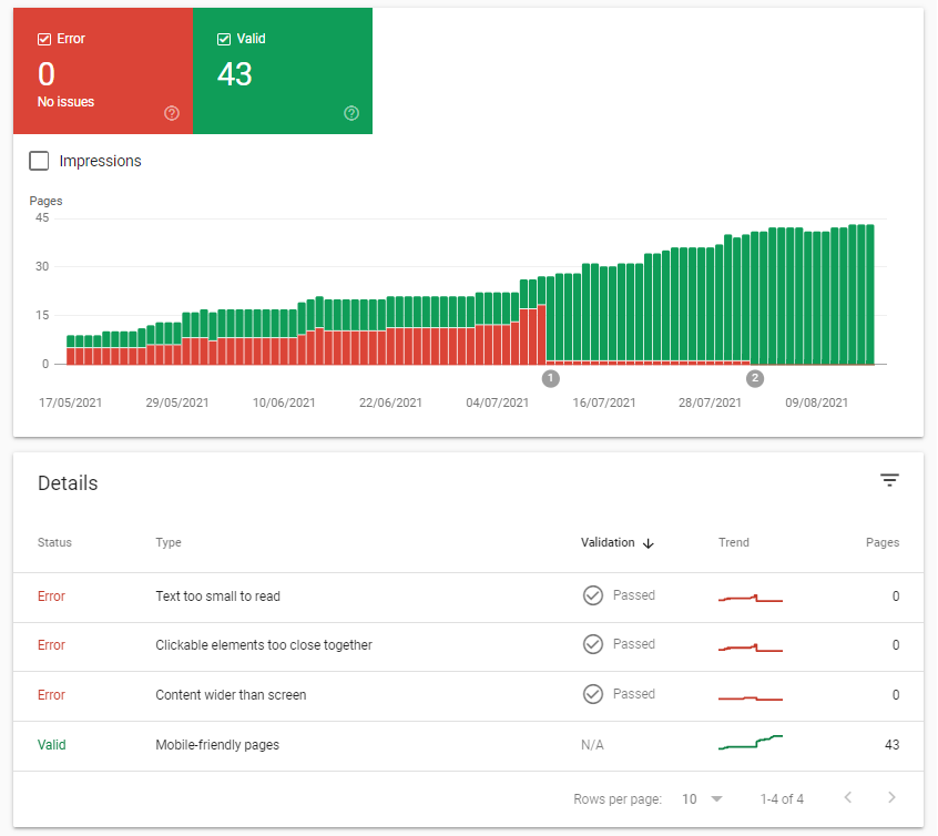
For the last error of content wider than screen, it was actually an image of mine which was not responsive so if you have that you will have to check how to remove it or make it responsive.
That’s it let me know if it worked for you!

6 replies on “Fixing Text Too Small To Read Google Search Console WordPress”
Thanks. Works well on https://crimeinamerica.net except for the link inserts which are simply too large.
Suggestions?
Appreciate your assistance. Best, Len.
No problem. Try adjusting the font-sizes for “a” from 1.5em to 1.25em or 1em. a tags are related to links, but you can modify anything that you feel is too big the same way 🙂
For example:
@media only screen and (max-width: 1024px) {
a {
font-size: 1.25em !important;
padding: 1em;
}
input {
padding: 1em !important;
}
.meta-text {
font-size: 3rem!important;
}
time {
font-size: 1.5em!important;
}
.ancestor-wrapper {
padding: 1em;
}
.entry-categories {
display: none;
}
.wp-block-code {
font-size: 1.5em;
}
p {
font-size: 1.5em!important;
}
}
Much better: You are wonderful!!!
Many thanks for the courtesy of your reply.
Best, Len.
It’s really a nice and useful piece of information.
Hi @everythingtech.dev,
This worked like a charm. I had been looking for a simple solution and was dreading it. I’m so glad to have found this. So simple and effective.
Many thanks and Merry Xmas!
Thank you and Merry Christmas to you too!